
A Matter of Colour
The need for accurate colour management in photography
When I started out in photography I relied upon film laboratories to process negative or slide film to get the appropriate output, either prints or mounted slides. Once the image was taken in the camera the actual processing was beyond my control but in general there was good agreement between my memories of the scene and the actual image. Step forward in time to digital image capture and home printing. Like many people the images coming from my printer weren’t showing the same as the images on my computer screen. They were dark, lacking in vibrancy and quite often disappointing.
Although I could often rectify the problems with the printed image though further editing in software, increasing brightness, colour saturation, etc. much of this was through trial and error. The time taken to get the prints correct and the amount of relatively expensive inkjet photo paper wasted due to test printing soon mounted up. Also, in order to get the prints correct on the printer I had to adjust the images so that they were overly bright on the screen. This resulted in a reluctance to print images out and most of my photographs became lost in the depths of my hard disk never to be seen again.
What I really needed was a colour managed system so that images shown on the computer monitor were as taken by the camera and as output by the printer. Images would be right first time and no longer would there be a waste of ink and paper.
Where to Start ?
Like many photographers I take my hobby seriously. I take time to get the correct composition using the right lens. I choose the best combination of shutter speed, aperture and ISO to get the image I want and I look forward to getting home to see the images on the computer screen. Often the images don’t look like I remember, reds look like tomato soup, blues look washed out, greens appear fluorescent. Never mind though, a bit of time spend processing in Adobe Lightroom or Photoshop will soon sort that out.
When the post processed image is printed though it looks nothing like the masterpiece i’ve spent hours achieving - reds are washed out and undersaturated, blues look too vivid and the greens are almost monochromatic, What went wrong?
How do I know that my computer monitor is showing me the proper brightness and colors? Without some sort of colour calibration, can I trust what I am seeing on my computer monitor? Even if i’m not printing an image, how can I be sure that someone else viewing it on their computer is seeing the same image that I am? What if I upload to social media, will everyone see the same colours? Unless this is sorted nothing else will fall into place.
Putting effort into setting things up correctly at the beginning often leads to better results at the end – like color correcting your digital camera, monitor and printer before you start shooting. While you can certainly make adjustments to your images by eye in post-production, taking a minute to capture an image of a calibration chart first saves considerable time and effort getting accurate colours in your images during post production.
Colour management starts with your computer monitor
Straight out of the box different monitors have different colour settings. Once you start adjusting the settings for individual monitors brightness, contrast, colours, white point, etc. it is not surprising that everybody’s monitors show different colours. Personally I use two Apple computers, a 5k 27” iMac as my desktop and a 15” MacBook Pro laptop. Viewing these two computers side by side it is clear that the same image displayed on each computer screen has different colours - the laptop screen is brighter and has a noticeable bluer display than the iMac for instance. Which one is the correct image?
There are many approaches to calibrating your computer monitor from free software to sophisticated hardware systems that can cost many hundreds of pounds or more. For a long time Microsoft Windows has provided a simple calibration approach that involves squinting at multiple colour patches shown on the screen and adjusting sliders until you can’t tell the difference between patch A and patch B. Similarly in MacOS, Apple has provided a utility where you adjust settings until the Apple logo merges into the background. While these approaches do help, to a large extent the results are subjective and you can get different calibrations depending on who performs the test and how good you are at squinting.
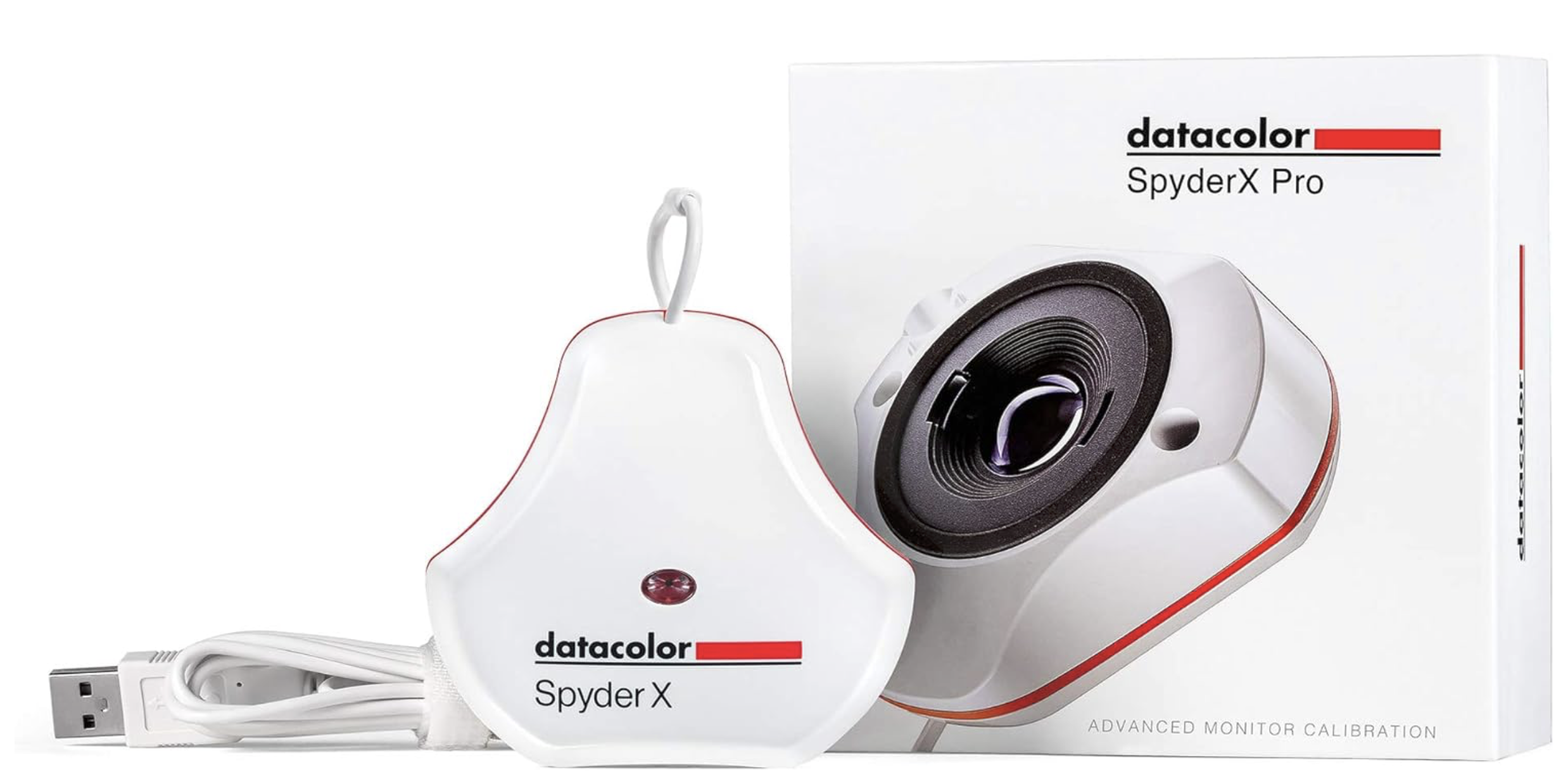
For many years there have been more objective ways to calibrate the computer screen, some extremely expensive and others at more reasonable prices for a typical photographer. Over the past 10 years or so I have been using various DataColor Spyder colour checkers as an affordable system - the Spyder X I currently use cost approximately £120.
The Spyder X Pro is a very easy to use calibration tool. Just install the software (Mac or Windows versions are available) and run the program. The software walks you through the measurement process, instructing you how to adjust the display brightness and when and where to position the calibrator on the screen. Once that’s done everything else is automatic. The software displays a range of red, blue, green and grey screens of varying brightness on the monitor and the hardware calibrator measures the colours being displayed.
Knowledge of what colour was instructed to be shown and what actual colour was measured by the calibrator allows the software to develop a profile for the computer display. The whole process takes approximately 2 minutes until a “before and after” screen is shown. The computer will now automatically use the calibration profile each time you turn it on. As the monitor is now calibrated you shouldn’t adjust any of the brightness, contrast or colour controls without re-running the calibration.
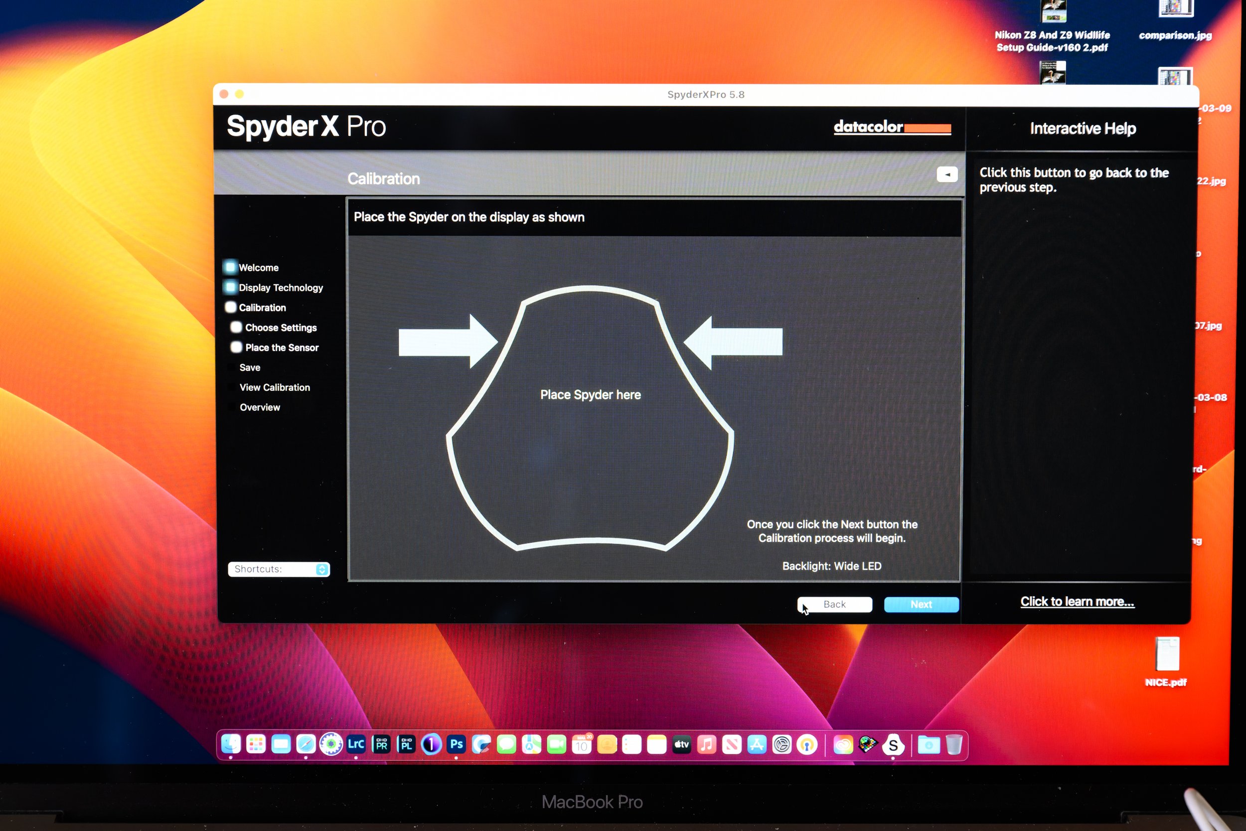
Once you run the software it will ask a few questions regarding what display control you have then ask you to position the Spyder on the screen
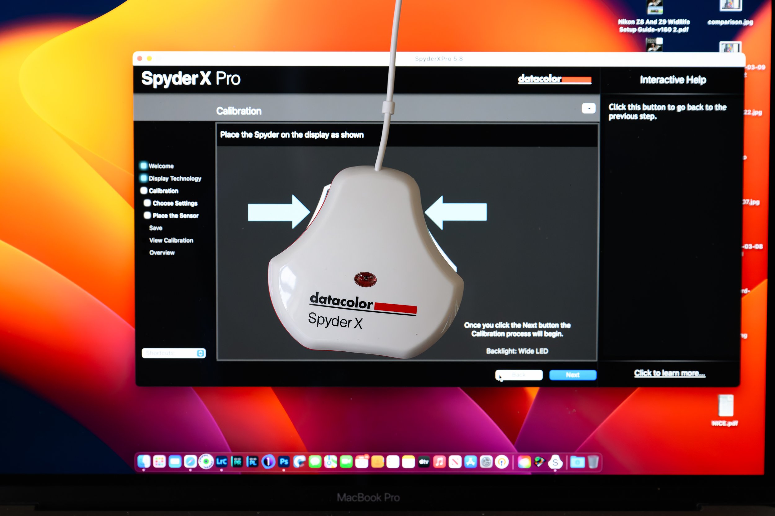
Place the Spider so that it fits within the identified area
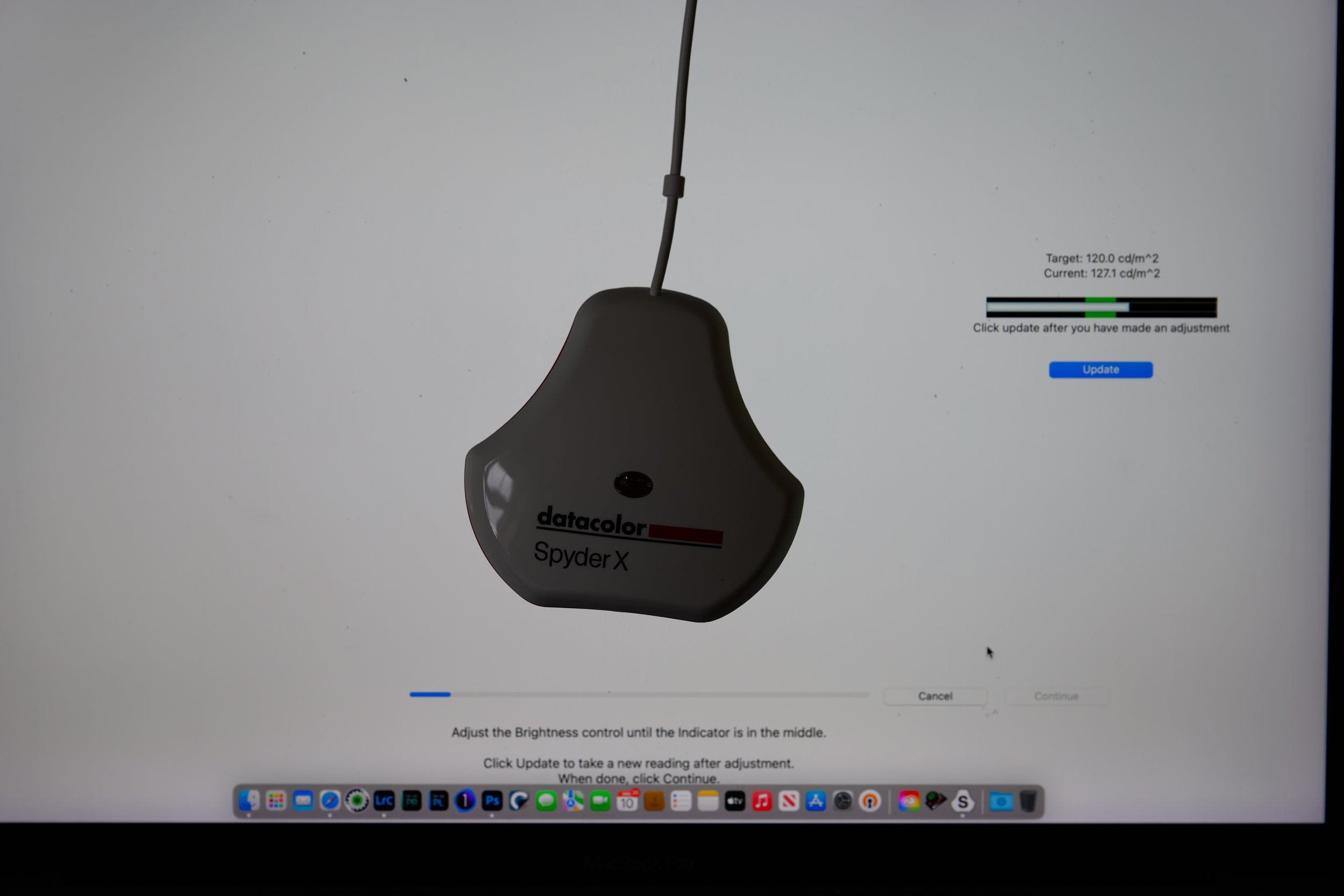
The software will ask you to adjust the brightness of the screen using the built in controls until the measured brightness matches the target value for the screen
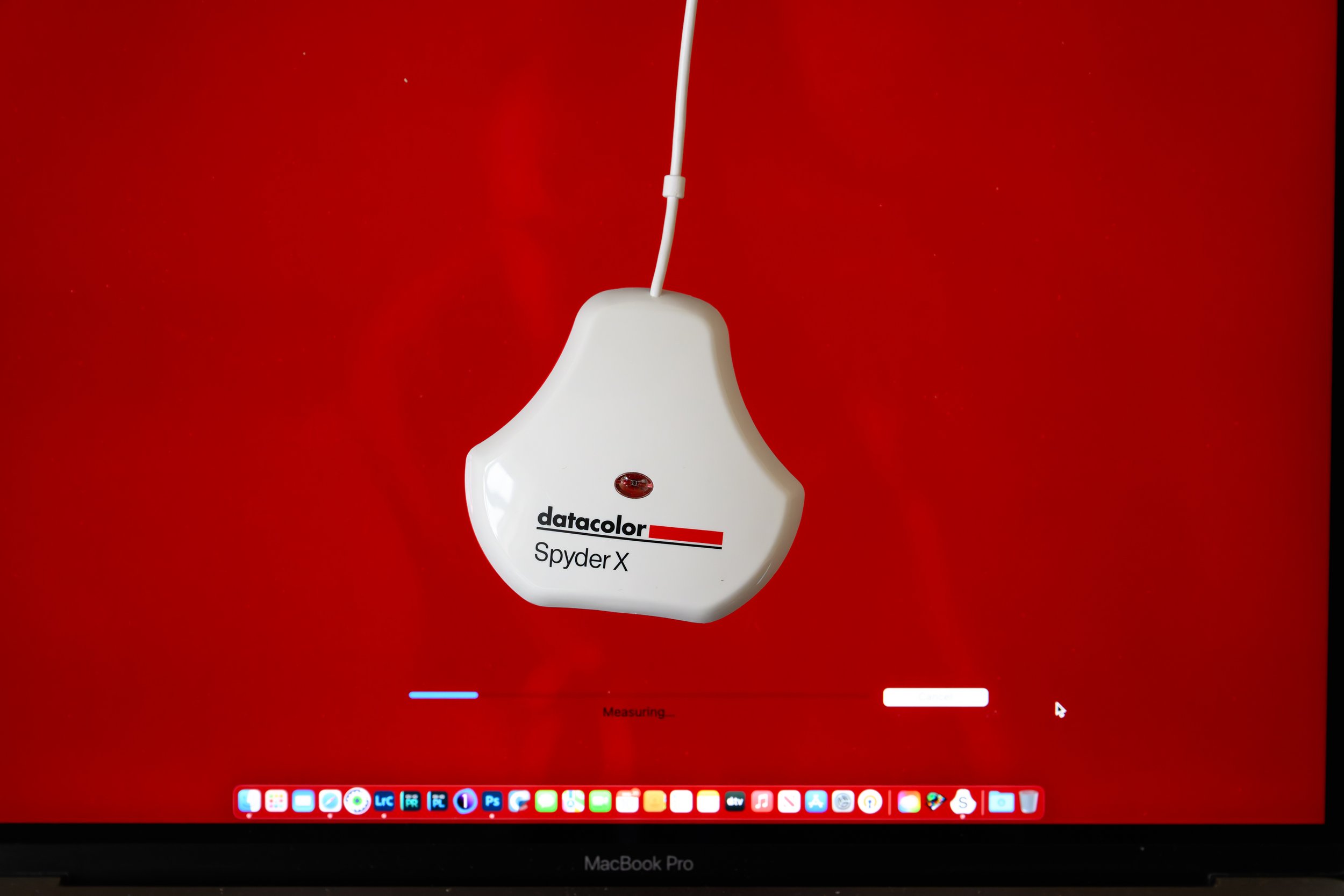
After setting the brightness, the software measures a range of reds at different brightness levels
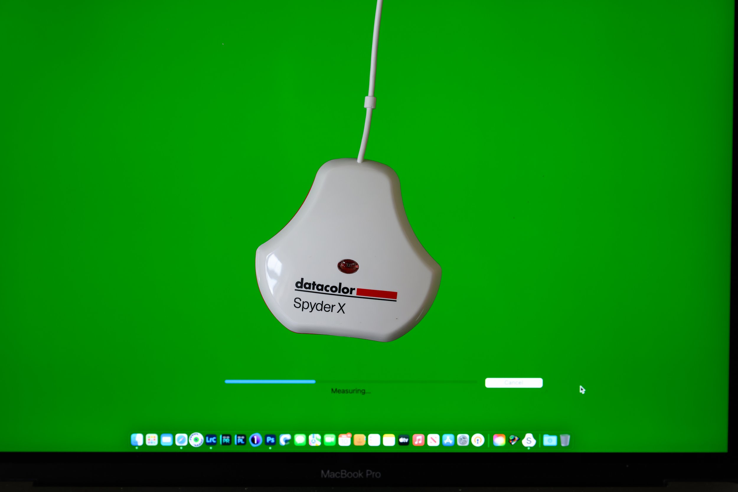
Then the greens…
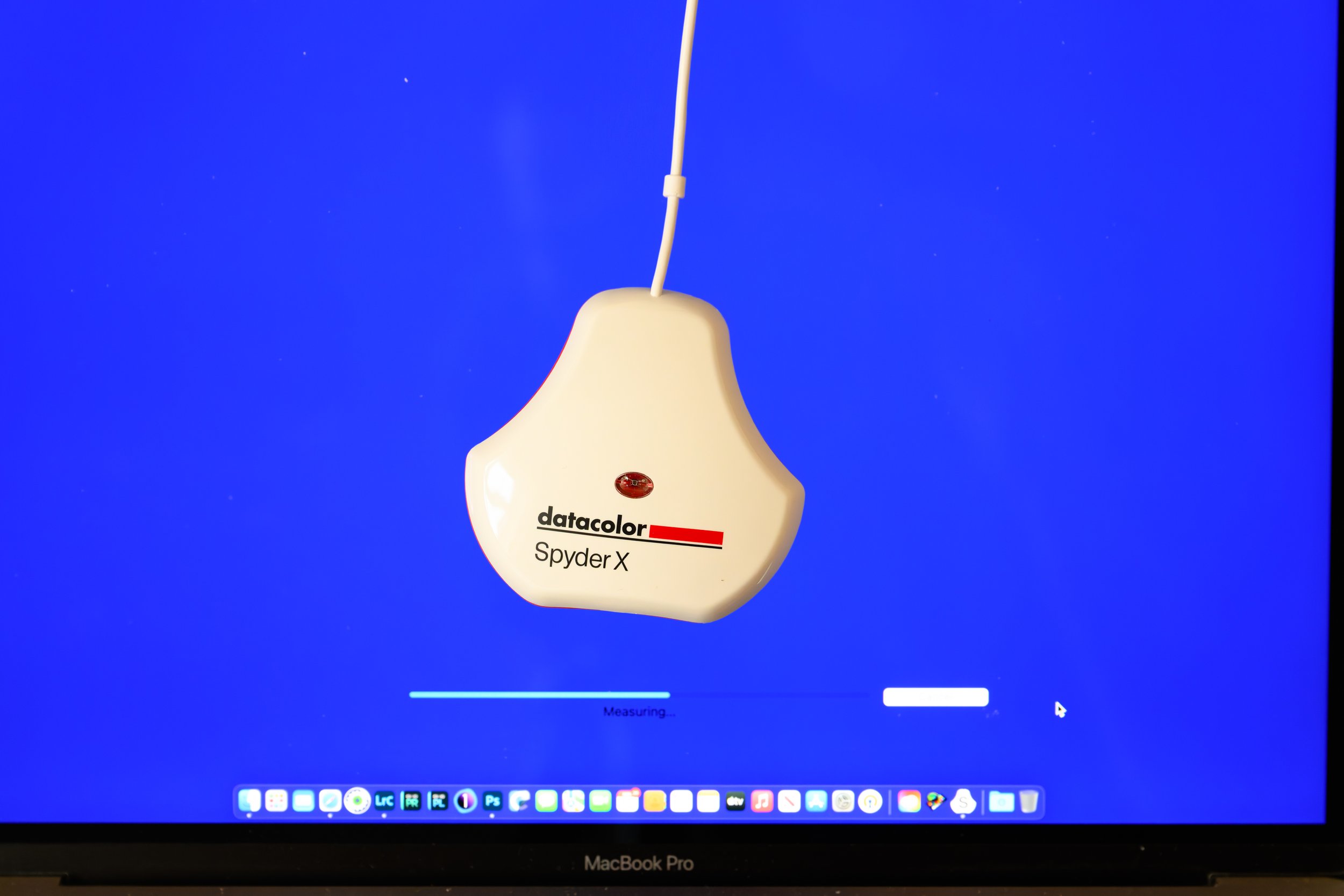
Then the blues…
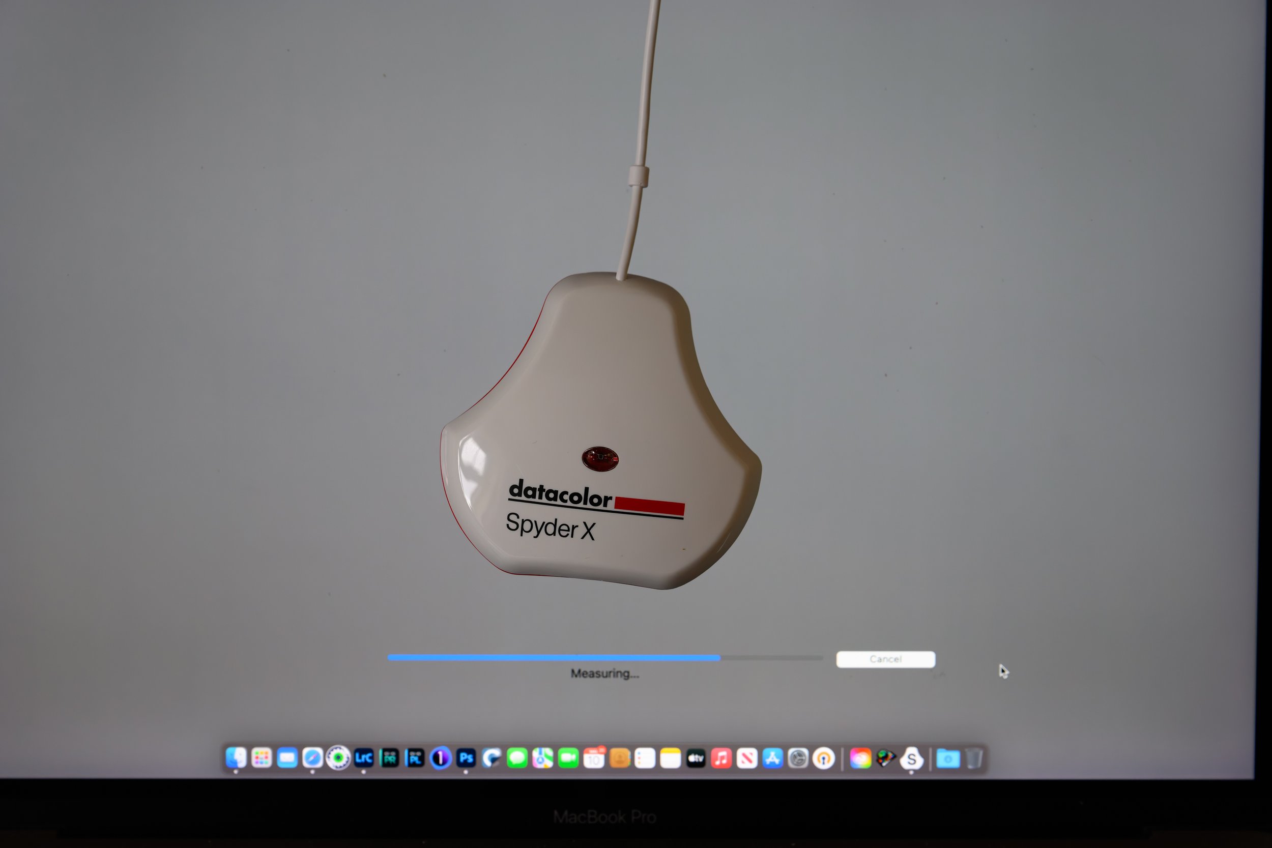
And finally the greys.
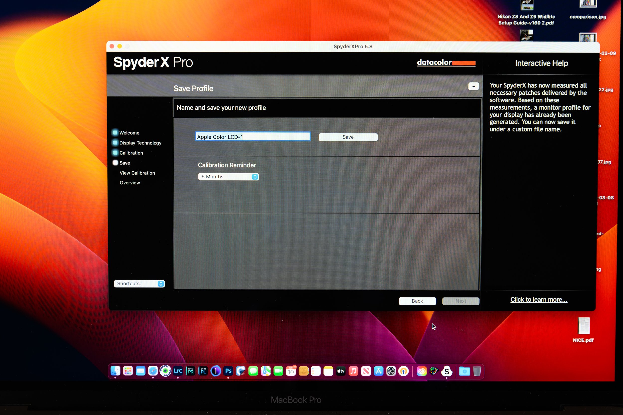
Once the profile is complete you are asked to save it
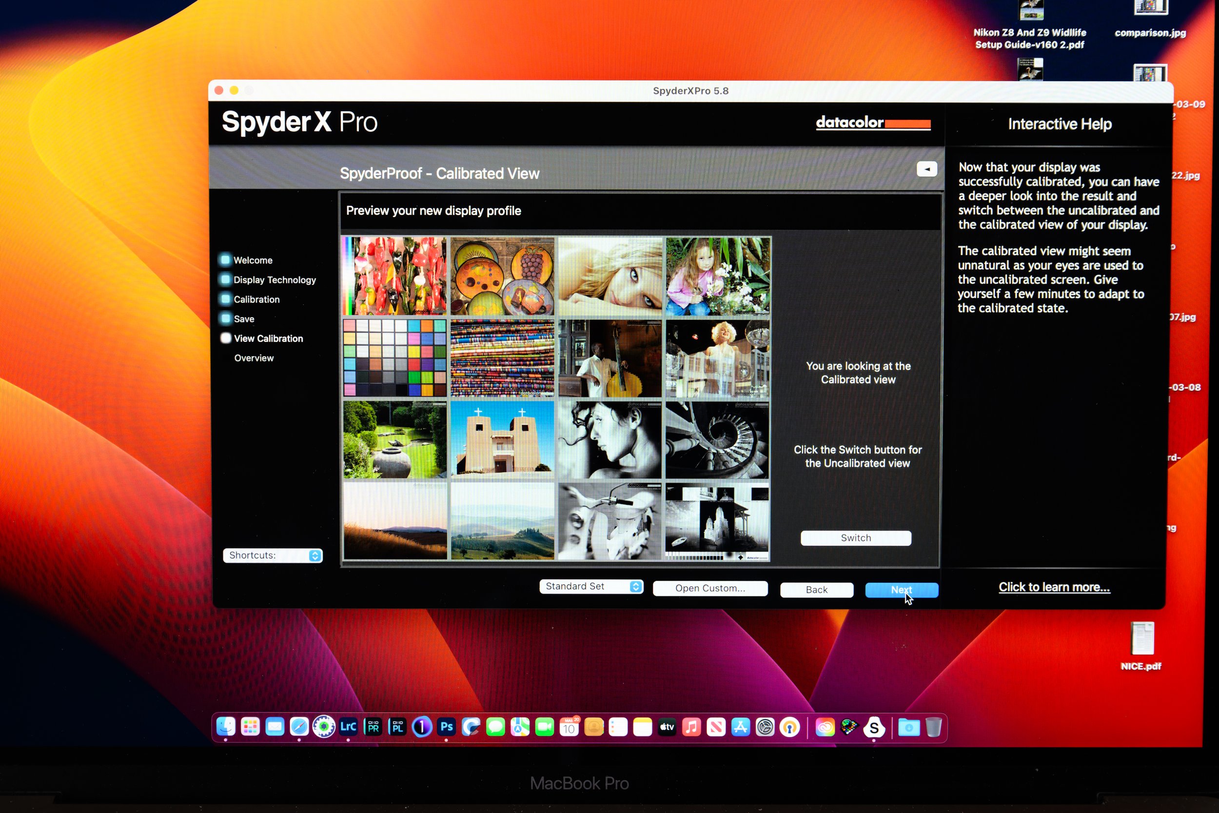
The software then shows you the new settings and allows you to see a before and after view of how the monitor colours have changed. My MacBook Pro Display was too bright and had too much blue colouring.
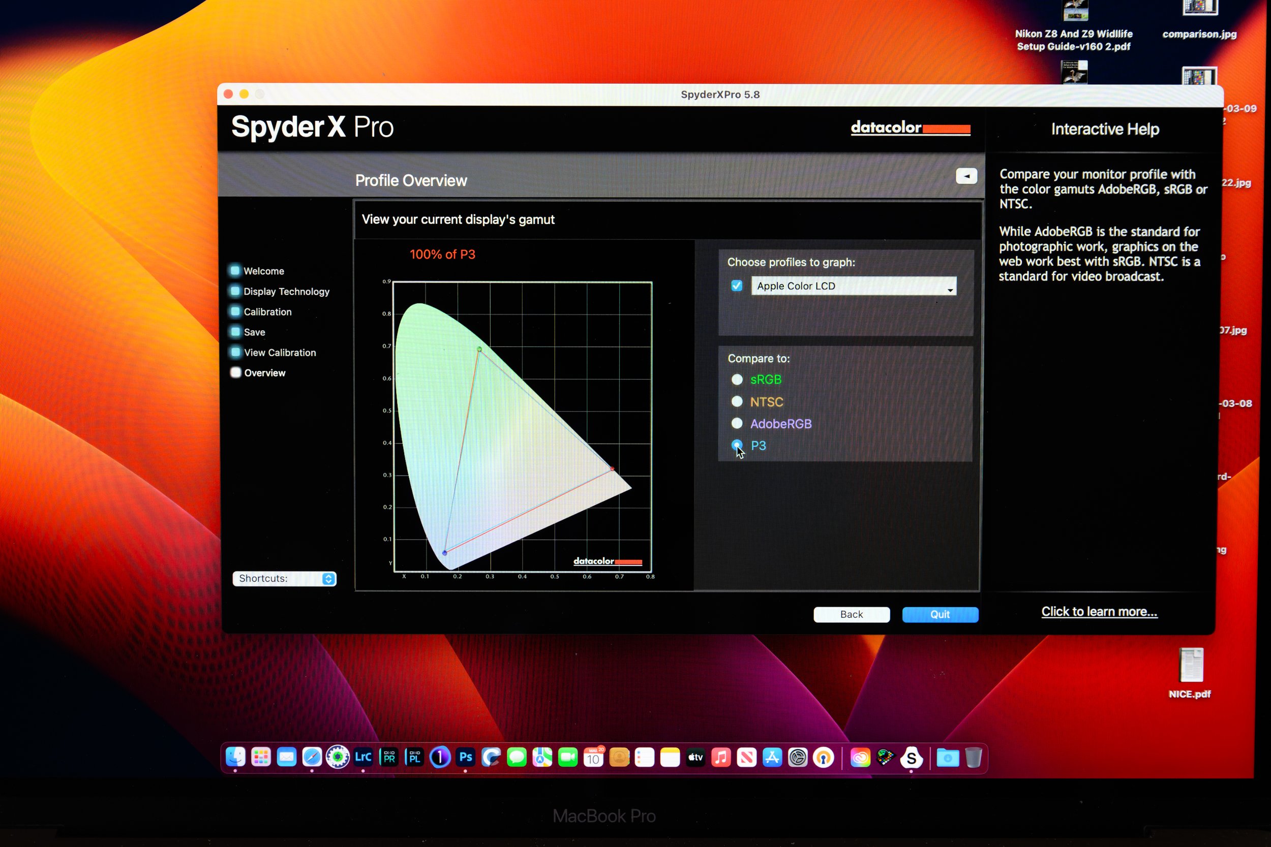
Finally you are presented with a plot of the colour gamut of your screen compared to standard ranges of sRGB, NTSC, AdobeRGB and P3. My Apple display is claimed to be P3, and the software tends to agree !
It’s not obvious from this blog post but my Apple MacBook Pro 15” display was way too bright and also had a very blue tint. Post calibration the screen is much closer to real colour for my images.
Printer Profiling
The next step in the colour management process involves the printer. How do you ensure that the image you send to the printer is what actually comes out on the print?
Similarly to screen calibration, there are packages available that require you to print out a test page and then use a calibrator (colorimeter) to measure the printed colours and compare them to what you actually sent. Thankfully, many of the printers aimed at photographers have this already done, either by the manufacturer or by suppliers of printer paper and inks. These paper/ink profiles are downloaded from the printer or paper manufacturers’ websites and can be installed into whatever software package you use for printing (e.g. Photoshop).
When you come to print, just select to let Photoshop manage the colours in the print dialog box and choose the correct profile depending upon your printer, ink and paper type. This takes away all of the hard work of performing your own printer calibration.
What if the camera sees things differently?
The final part of the colour management workflow is the camera. This is the topic of the next post.
The Final Word
Having spent time setting up the monitor and printer profiles I have been able to achieve good colour matching between my computers and printer. Now, no matter which computer I use to process and print my images I can be sure that the resulting paper copies will be identical. This is a process that doesn’t have to be repeated each time you print (DataColor recommend repeating the display calibration every 3 months) so the time performing the profiling is well worth spending to avoid the need for constant trial and error printing. Similarly the expense of the DataColor purchase is more than recovered from the reduction in wasted ink and printer paper.