
A Matter of Colour Pt 2: Camera Calibration
In the last blog post I discussed the calibration of my workflow from computer monitor to printing in order to get consistent and predictable colours for my final images. In this post I have looked further at the camera calibration part of this process using a number of commercially available colour checker charts and software profilers.
The final part of our colour management workflow is the camera. We have ensured that images on the computer screen are faithfully represented in the final print. For many types of photography having accurate colours in the image is actually not that important as the image is generally meant to evoke an emotion. Sunrise and sunset shots are intended to exaggerate the effect of warm lighting on the landscape. If we wanted accurate colours the effect would be lost. For other types of photography accurate colours are essential. Imagine shopping for clothes online or through a catalogue and receiving goods that didn’t have the same colours as you ordered, or taking someone’s portrait only to find the images made them appear ill due to a colour cast. This is where camera calibration becomes part of the process.
Different camera manufacturers and different models interpret colours from the sensor in different ways so relying on camera previews or JPEGs before post-production isn’t an accurate way to assess colour.. The raw data acquired by the sensor is basically comprised of measuring the amount of light (luminance) hitting the individual pixels (photosites). The photo sites don’t have a specific colour response so they are effectively masked using red, green and blue filters generally in a 2x2 array (red, green, blue, green) known as a Bayer grid. The luminance measured by photo sites is then interpreted by the camera software to create an RGB value for each pixel. The camera manufacturer is responsible for how this interpretation is performed, resulting in differences in colour between Canon, Sony, Nikon cameras and often differences between individual models in a certain manufacturer’s range. Nikon is widely regarded as having the most “true to life” colours, while Canon has more flattering skin tones etc. Within the Nikon line up, the D700 and D3 were regarded as having the most realistic colours from the CMOS sensors, but even these were no match to the colours from the CCD sensor in the long discontinued D200.
With all this variation there is a need to calibrate how the camera interprets the colours when the image is taken. The benefits of shooting raw images makes it possible to almost infinitely adjust specific colours to obtain the most faithful rendition of the scene, but having the best colour match as a starting point makes this much easier for the photographer.
Shooting a set of reference colours in the image makes it possible to adjust the raw image from the camera in a similar way to how we have calibrated our monitor and printer. A number of manufacturers supply reference colour charts that are produced against international standards to permit this calibration. Software then compares the raw image data against the reference colour values to determine a calibration profile for that particular scenario. This can then be applied to all images taken with that camera in those specific lighting conditions. Profiles can be remeasured and recalculated any time the lighting conditions change.
Which Colour Checker should you use?
X-rite ColorChecker Passport 2
As I previously mentioned I started with the X-rite ColorChecker Passport 2 and X-rite’s ColourChecker Camera Calibration software.
The ColorChecker Passport is a portable colour chart that is encased in a hard plastic clamshell and is supplied with a long lanyard attached to it (although I’ve removed it). There are four pages inside. Going top to bottom on the image below, according to X-Rite, the first row of colors is used “to ensure color fidelity across all hues”, while the next two rows of grey squares are “Creative Enhancement Targets for creating a warmer portrait photo or to go either warmer or cooler on landscape photos. This is because sometimes, a neutral white balance may end up making skin tone look a little clinical, and some color casts like sunset is preferred.
Finally, the last row of greyscale squares from black to white is to check exposure, shadow and highlight clipping.

The lower page is the ColorChecker Passport Classic 24 Target. These 24 colour squares form a standard colour reference target for creating DNG/ICC profiles and for evaluating specific colour tones. The colours are specifically calibrated to match industry standards, but also represent the colours of natural objects, such as blue sky, light and dark skin tones and green foliage. Each colour patch is designed to reflect light just like its real world counterpart. Each square is individually coloured using a solid tone to produce pure, flat, rich color without dots or mixed tints.
As they are industry standard reference colours, the Color Checker Passport software will calibrate colours to match these patches so that any camera should provide the same colours. This is a bonus if you use multiple camera bodies and multiple lenses allowing you to ensure uniformity between the various cameras.
The last two pages consists of a large spectrally flat white balance target and a similarly spectrally flat 18% grey target for measuring exposure.
Using the X-rite Color Checker Passport 2
When you are ready to start your shoot all you need to do is take a test photo with the ColorChecker Passport 2 in the frame. Position the Color Checker Passport with the Enhancement and ColorChecker Classic 24 pages flat towards the camera. It doesn’t matter what orientation you use as the software can take care of this later. I generally stand the Passport vertically as shown below as it is easier to stand the device this way. If you have someone to hold the device it is often more convenient to have it arranged with the ColorChecker Classic card at the bottom. That’s it - just remove the ColorChecker Passport and continue with your shoot.
One important thing to remember is to not over expose your image, if you do clip any of the colour patches the software wont be able to create a profile. This is true even if you adjust the exposure settings in Lightroom or any other RAW editor as the ColorChecker Passport software will ignore any adjustments made to the RAW file. Also, be sure that the light is evenly hitting the Color Checker Passport at the correct exposure, and there not variations like shadowed areas, dappled light, etc.

Calibrite ColorChecker Passport 2 showing the image enhancement card on the left and the 24 ColorChecker Classic colour calibration chart on the right
For the purpose of this review, I have used the ColorChecker Camera Calibration Lightroom plugin to automate the profile creation. All you need to do is load the image into Lightroom, go to the File menu and select Export with Preset and then select the preset titled ColorChecker Camera Calibration. The plugin will ask you for a name for the profile and then process the image to calculate the calibration. It’s as simple as that !

Select Export with Presets from the File menu then select ColorChecker Camera Calibration

Provide a name for the profile - I suggest you include the camera model and lighting type so you can recognise the profile later
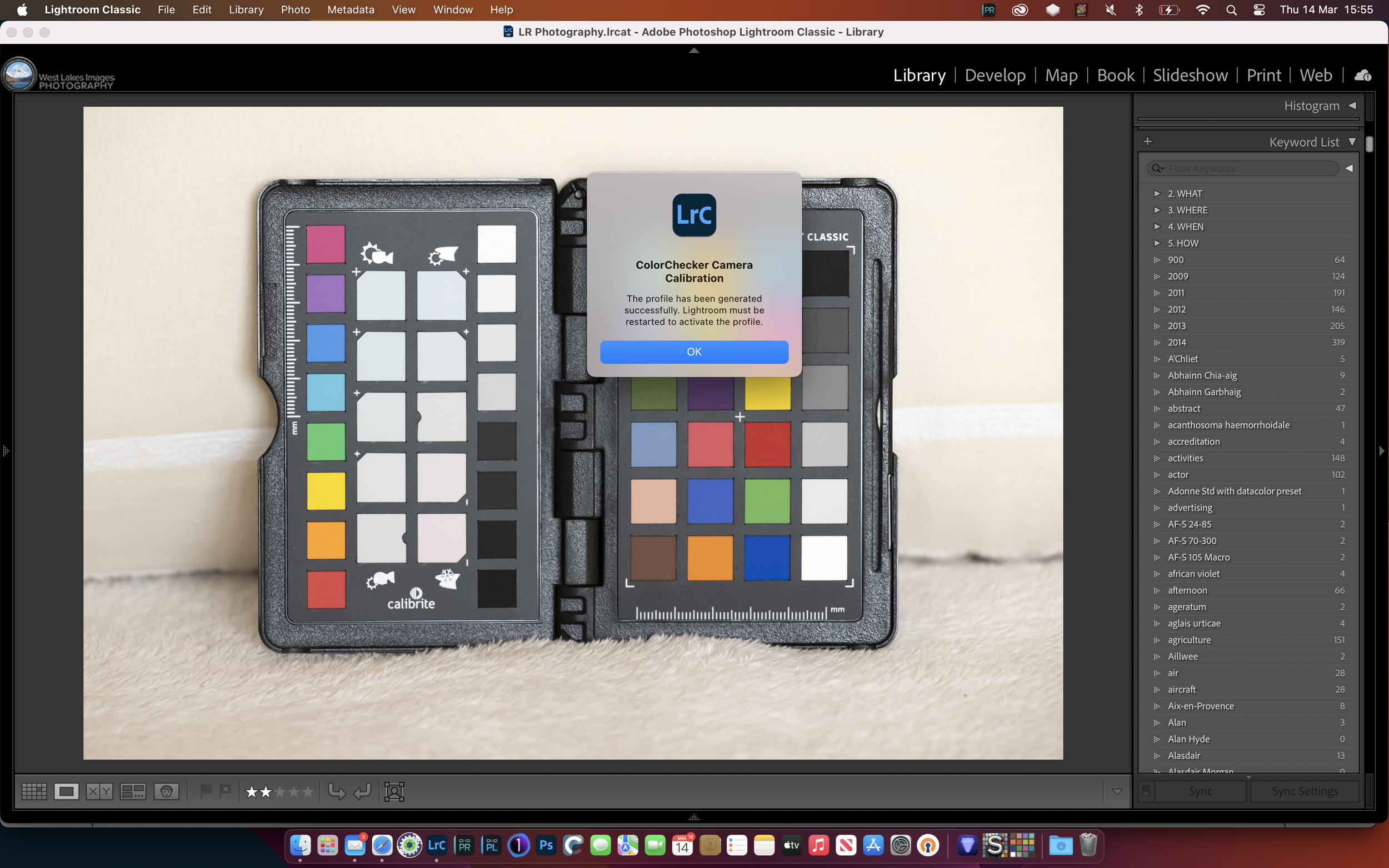
The profile is complete - you need to restart Lightroom for it to become available
The ColorChecker software reminds you that you need to shut down and restart Lightroom in order for the calibration profile to be available.
After restarting Lightroom select the image you wish to correct and go to the Develop module. Click on the four squares next to the profile and select browse, then scroll down to the Profiles section and select the profile you have just made.

To apply the profile, open the image in Develop module and select the four squares next to the Profile section, just under the histogram panel. Scroll down and select Browse.

Scroll down to Profiles and select the profile square you have just saved

View showing the differences in the blue and red tones. In this case the calibrated profile is the left hand image (select) while the Adobe Color profile is the right hand side (candidate)
To apply this profile to multiple images from the same photoshoot, in the Develop module select the image you have just corrected, then select all other images you wish to correct in the filmstrip view and then click Sync. In the selection menu that appears, select Treatment and Profile, then click Synchronise.
For the most part, I really do like the X-Rite’s ColorChecker Passport 2. It is small and convenient, takes seconds to shoot, easy to implement in post processing software. The only issue I have with the Passport is the build quality. When you open and close the device the plastic feels very flexible and twists and flexes quite severely. The hinge is probably the worst part - it feels like it’s about to break every time you move the pages, and there are often loud clicks causing you to check for damage. I’m not sure if it will ease with age, but this seems to be a regular criticism and various internet forums. Because of this I decided to try the competing Datacolor SpyderCheckr as well.
Using the Datacolor Spydercheckr
As I mentioned previously the X-rite ColorChecker Passport 2 is not the most robust design device - this must go to the Datacolor SpyderCheckr. This is a much larger device, probably 4x the size of the Passport 2 and comes in a sturdy plastic case with a nice hinge design. It has almost an aluminium feel to the case. Opening the case reveals the SpyderCheckr 48 patch calibration cards. These can be removed from the case and reversed to give a series of white balance and exposure graduation targets if necessary. They can also be replaced if they start to fade without having to buy a new unit.
Incidentally the bottom of the left hand page contains a FadeCheckr box. This red patch is exposed to light as you use the SpyderCheckr. There is an identical patch hidden under the page frame. If you open the frame you can check the colour of the exposed patch against the concealed one. The exposed patch will start to fade to a yellow colour when compared to the red concealed patch, indicating that its time to replace the cards.
Overall the SpyderCheckr is a much nicer designed and built unit when compared to the Passport 2.


In use, the SpyderCheckr is ver similar to the Passport 2 discussed earlier. You just position the chart in the first shot ensuring that the device is facing the camera in the same lighting conditions as the subject. in this case it is more important to ensure the SpyderCheckr is orientated correctly as the software requires you to match the colour patches against the cards. This becomes much more difficult if the cards aren’t level or are rotated through 90 degrees for instance. To help with this, however, the SpyderCheckr is fitted with a ¼” screw socket so it can be mounted on a light stand or tripod for positioning in the image.

SpyderCheckr calibration cards in the correct orientation
The Datacolor SpyderCheckr software is also available as a Lightroom plugin but this time there is more manual input required. According to Datacolor, in order to get the best profile you need to take the following steps.
Crop the image to show just the SpyderCheckr including the black frame.

Take a white balance measurement from the 20% grey square (E2) on the chart. Next, adjust to exposure slider to ensure that the RGB values for the pure white square are set to approximately 230, 230, 230 or 90%, 90%, 90% in Lightroom. Once this is done, adjust the Blacks slider so that the card black square (E6) has an RGB value of approximately 10, 10, 10 (or 4%, 4%, 4% in Lightroom). Double check each of these settings as they can change during the exposure adjustment.
If necessary use the Lightroom crop tool to rotate the image and the distortion panel to adjust for any skew or keystoning in the image.
Once set up correctly, select Edit in from the Photo menu and then select Edit in SpyderCheckr

Select Edit in from the Photo menu and then Edit in SpyderCheckr

Ensure that you select Edit a Copy with Lightroom Adjustments (otherwise all of the exposure and white balance changes you just made will be lost) and that you edit as a Tiff file, set with AdobeRGB and 16bit.

You now need to line up the small squares in the overlay with the correct coloured squares on the image of the SpyderCheckr. Now you know why it’s important to get the orientation of the SpyderCheckr correct and use Lightroom to remove any rotation or distortion. The following image shows the grid correctly aligned.

Once the grid is aligned correctly, select Colorimetric for the Mode and Save to Lightroom, then click on Save Calibration

Once you click save the software will ask you to name your calibration file

As with the ColorChecker Passport 2, SpyderCheckr will require you to restart Lightroom before the calibration profile becomes available.
On completion of the profiling you must exit and restart Lightroom to make the profile available. The SpyderCheckr differs from the Passport in that it stores the calibration as a Develop Preset rather than a Profile. To apply the calibration, select the image in the Develop module, click on Presets in the lefthand panel and click User Presets then the preset you have just saved.

Note that once the calibration preset has been applied the preset adjusts the colour value sliders in the Hue, Saturation and Luminance panels on the right
To apply this profile to multiple images from the same photoshoot, in the Develop module select the image you have just corrected, then select all other images you wish to correct in the filmstrip view and then click Sync. In the selection menu that appears, select the Basic settings, Curve and Color Mixer settings, then click Synchronise.
I prefer the hardware of the Datacolor SpyderCheckr over the X-Rite’s ColorChecker Passport 2. It’s a more considered design and the greater size makes it easier to use in the frame. i’m not so sure of the Datacolor software though, as the use of Develop Presets means it applies the colour correction after the image has already been loaded and assigned one of the standard profiles. I’m not sure, for example, whether the Develop Preset would give different results if the image was loaded using Adobe Vivid rather than Adobe Color, or if the Camera Matching profile were used what effect that would have. Also you have to be much more careful how you position the target in the frame or you need to spend a lot of time adjusting the geometry in Lightroom.
Lumariver Profile Designer 2
Lumariver Profile Designer 2 is a software package that makes profiles for your camera, video camera or scanner, in DNG Camera Profile (DCP), ICC format, or Cube LUT format, and therefore supporting almost all raw converters and video editors on the market. As I’ve discussed above, I preferred the Datacolor SpyderCheckr target but didn’t like the software supplied by Datacolor. so I thought I would give Lumariver Profile Designer a try.
The software is a standalone package rather than a Lightroom plugin and at first glance it looks similar to the Datacolor software, but it is much more flexible. For example, you still have to place a grid over the target image like in Datacolor, but the control of the grid is much greater so you can twist, rotate, distort and warp the grid to fit over the target patches rather than simply scale and position. This makes Lumariver Profile Designer much more flexible in target acquisition. Lumariver Profile Designer is also able to use a large number of calibration targets, see below:

The first step with Lumariver Profile Designer is to acquire an image of the calibration target and then load the image into the software. The Standard Edition I used requires the image be converted to DNG raw format in order to calculate the calibration profile. These profiles are in Adobe friendly DNG Digital Camera Profile (DCP) format but other versions allow ICC and Cube LUT formats as well.

Target image loaded into Lumariver Profile Designer. Note I have loaded both the Datacolor SpyderCheckr and the X-rite ColorChecker Passport 2 in the image so I can see if there is any difference in the profiles created from these two targets. Also the image shows the difference in size between the two targets.

After the images has loaded select the parameters for the profile. Here I used the Prophoto colour space with a gamma value of 1.8 (standard) and selected the ColorChecker Passport as the target. All other settings were left at their default values. Once everything is completed click on the Show Target Grid button and the following screen is displayed.

You now need to move and resize the grid to fit over the target patches. Drag the corners of the grid over the target being careful to line up the small coloured squares one the grid with the target.

The Lumariver Profile Designer grid adjustment is much more flexible than the Datacolor software. Here the grid is being distorted to start to rotate it to align with the Passport.

When you are close to aligning the grid, click the 1:1 button under the right hand corner of the image to zoom in for fine adjustment. The image shows all of the grid squares centralised over their respective target patches on the Passport. Once complete tick the Grid its in place box. and then render the profile.

The profile is rendered and you can immediately see the difference in the colour swatches. Click on the DCP tab to save the file.

In the DCP Export tab you are asked to provide a profile name and any copyright details you wish. Click Export DNG Profile to save the file.
As with the previous two packages you need to exit and restart Lightroom in order for your newly created profile to be visible. The profile is created in the Profiles section of the Develop Module as with the X-rite CollorChecker profiles.
How they compare
I tested how the profiles compare to each other by taking the same source image compressing both colour targets and processing it in the X-rite ColorChecker Camera Calibration software, Datacolor SpyderCheckr software and by using it in Lumariver Profile Designer twice, once for each target. The following image shows the X-rite ColorChecker Passport 2 profile (left) and the Datacolor SpyderCheckr preset (right) - move the slider left/right to see the difference in colours of the patches.
Looking at the two profiles there are clear differences in Datacolor colour patches:
A4 (cyan), A5 (blue) - in the ColorChecker profile these two colours are quite distinct whereas the Datacolor colours are less distinct
F1 (primary cyan), F4 (primary red), F5 (primary green), F6 (primary blue), G1 (primary orange), G2 (blueprint), G3 (pink) and G4 (violet) - the ColorChecker profile has more saturated colours that are closer to the actual target patches while the Datacolor colours are more muted
The following shows the Lumariver Profile Designer profiles for the X-rite ColorChecker Passport 2 (left) and the Datacolor SpyderCheckr (right) targets. In this case the Lumariver software has created almost identical profiles based on the two different colour checker targets. The before and after images show little if any difference in colour patches.
Camera calibration is not essential for many photographers due to the manipulation of colours, white balance, etc to achieve a desired look to the image (sunrise/sunsets, etc). Where it does become essential though is for accurate product photography, portraiture and artwork reproduction. Imagine having a photoshoot rejected because the colours in the image didn’t accurately reflect the product branding for example. In these cases, spending a few minutes shooting and profiling a ColorChecker card can make the difference between the client accepting or rejecting images.
Additionally, if you have multiple cameras from different manufacturers and want to get a consistent look it is possible to create camera calibration profiles to achieve that.
This is not intended to have been an in-depth review of the colour management process, there are may articles available that go into much more depth than I have here. I intended it to be a quick look at a couple of calibration targets and software to see what I thought I would use going forward. With the use of the Lumariver Profile Designer I can now use both the X-rite ColorChecker Passport 2 and Datacolor SpyderCheckr 48 targets and obtain consistent results using either or both of them.


